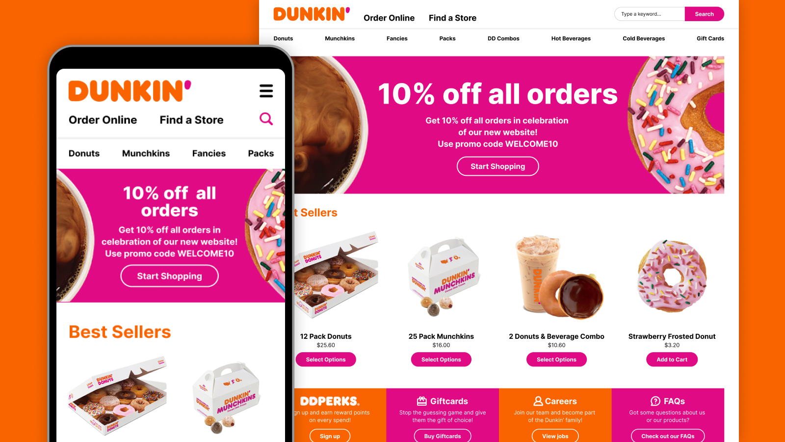
In 2023, Stuff introduced digital versions of their masthead newspapers — The Post, The Press and Waikato Times — to align with the shifting media consumption trends and harness the benefits of online platforms. The new websites run in a subscription-based model, similar to traditional newspapers, but adapted for the digital age. By incorporating a paywall, the websites deliver a strong value proposition: exclusive, high-quality, local news accessible to subscribers - anytime, anywhere.
For the MVP (Minimum Viable Product), I focused on a design that prioritises simplicity, accessibility and ease of use. The clean interface and intuitive navigation ensure that users, regardless of their technical and non-technical abilities, can effortlessly find, browse, and read articles. This design, complemented by minimal advertising, aims to provide an enjoyable user experience, which is crucial for converting free readers into paying subscribers.
By prioritising ease of use, the MVP establishes a strong foundation for gathering user feedback, which will help shape the product and guide future enhancements tailored to the audience's needs and preferences.
Post MVP improvements
Boosting engagement with an updated article page
A year after the initial launch of the masthead sites, we’ve focused on enhancing the article page to boost user experience, engagement, and trust, ultimately aiming to retain and attract more subscribers. After researching and analysing various article pages from different websites, here are the updates I implemented:

- Breadcrumbs - Added at the top of the page to show users their current location within the site and provide links to navigate through different sections
- Publisher information - Included the article publisher's name at the top (if not by the masthead site), clearly indicating it as a tappable link to encourage users to explore more content from that publisher
- Read time indicator - Added to inform users of the estimated time required to read the article, helping them decide whether to read it now or save it for later
- Image credit position - Adjusted so that image credits are displayed on the same line as the captions, optimizing vertical space
- Author byline - Revised to clearly indicate it as a tappable link, allowing users to easily browse additional content by the author
- Bottom tab bar - Introduced to provide convenient actions such as:
- Back navigation - Easily return to the previous page
- Listen to the article - Enable users to listen to the article while multitasking
- View and post comments - Allow users to share their opinions and read comments from others about the article.
- Save article - Allow users to save the article for later reading
- Gift article - Offer subscribers the option to gift the article to non-subscribers
- Share article - Allow users to easily share the article with their peers
- Adjust text size - Enable users to increase or decrease text size without leaving the site to change their device setting


In addition to the above improvements, I’ve also made a few updates for larger screen sizes:
- Condensed site header - Implemented a more compact version of the site header to elevate the content higher on the page and reduce scrolling
- Reduced heading font size - Decreased the font size of the heading to lift the content further and cut down on scroll
- Sticky 'action bar' - Added a sticky 'action bar' to the left side of the page, so it remains visible and accessible as users read through the article without being distracting, enhancing user engagement
Styling opinion and analysis articles for better clarity

As part of the article page update, I also introduced a more distinct visual style for Opinion and Analysis pieces to help readers quickly differentiate them from factual news—enhancing clarity and supporting reader trust. Previously, even with 'OPINION:' included at the start of the article body, many readers found it difficult to tell whether they were reading opinion or straight news. The new design makes this distinction more immediate, helping readers approach these pieces with the right context and understand them as individual perspectives rather than factual news reporting.
For these types of articles, I've highlighted the author’s name and background at the top to emphasise that this is their personal viewpoint. The center alignment of the text also provides a visual cue that these articles differ from traditional news content. I’ve also incorporated a drop cap at the beginning of the article to enhance visual interest and further signal the distinct nature of these pieces compared to standard news articles.
Reducing subscription drop-offs with an updated paywall and driving more subscriptions through complimentary articles
Data showed that while users are clicking through to the subscription page from the paywall, they stop there and do not complete the subscription. This suggests that while users are engaged up to this point, something on the subscription page may be causing hesitation or friction that prevents them from converting. While the Growth Marketing team has been actively testing various content strategies to reduce these drop-offs, we want to explore how we, from a Product Design perspective, can further complement these efforts to reduce drop-offs and improve conversions.
After doing some research and checking out other subscription sites, one thing stood out—many of them let users see and pick their subscription options right within the paywall. This made the whole process a lot easier, since people didn’t have to go to a separate page full of subscription offers. It also helped avoid overwhelming users by keeping things simple and clear.

In comparison, the paywalls on our masthead sites didn’t give users enough information up front and made the subscription process more complicated. Users had to click through to a separate page full of subscription options, which could feel overwhelming and demanded more decision-making effort, causing them to abandon the process before subscribing.

During my research, in addition to the subscription options being presented on the paywalls, I also saw a missed opportunity that's being done by some of the subscription sites to encourage subscriptions before users encounter the paywall. I discovered that we could inform users when they are reading a complimentary article and suggest that subscribing would provide unlimited access to all content. This gentle reminder also alerts users when they are about to reach their limit, making the transition to the paywall feel more natural while also offering an additional prompt to subscribe.
I also observed that our current homepage subscription popup may be poorly timed, as users haven’t yet engaged with enough content to determine its value. I proposed removing this popup and instead focusing subscription messaging within complimentary articles, where users are in a better position to assess whether a subscription is worthwhile.
Current experience

Proposed experience

Wireframes showing various subscription driver and paywall experiences


High fidelity UI of the subscription drivers and paywall

Closer look at the paywall before and after

The new paywall now includes subscription options, as well as a link to view more offers. I also moved the login link to the top of the paywall, making it easier for logged out subscribers using screen readers to access the link directly, without having to listen to the entire paywall content. Additionally, the "Subscribe with Google" link has been updated to align more closely with familiar Google branding, making it easier for users to recognise and trust the option.
Closer look at the subscription drivers on complimentary articles
.png)
The introduction of subscription drivers informs users how many complimentary articles they have remaining, setting clearer expectations around access limits. This helps prepare users for the paywall, making the transition feel more natural and less abrupt. It also features a call to action to subscribe for unlimited access, with subscription options displayed in alignment with the paywall design.
Chosen path
The previous paywall used an inline format, so the necessary code was already in place. As a result, the inline option was chosen to be implemented for both the subscription driver and the new paywall. That said, there are plans to A/B test both the inline and overlay options for the paywall to see which would perform better.
Impact and future potential
While some improvements were successfully implemented, contributing to the websites hitting their highest ever combined audience in November 2024 with 1.01 million Kiwis engaging with the platforms, most of the work was paused due to budget cuts and limited resources. However, the research and design solutions developed remain a valuable asset, and should development resume in the future, they are anticipated to drive even higher audience engagement, subscription retention and acquisition, positioning the product for long-term success.