In 2024, Stuff underwent a replatform and moved into a new tech stack, exiting cost and complexity by retiring numerous end-of-life technologies, including legacy CMS. With this, we've taken the opportunity to also provide a new website and app experience, setting the stage for future enhancements based on a targeted product strategy.
For the new website and app, we wanted the design to be true to Stuff's brand identity, with an emphasis on live, lively & breaking content, credibility, boldness and spiritedness while respecting accessibility. We also want it to be unmistakably Stuff, and be distinctive from other news sites.
Most importantly, we wanted to ensure our brand language does not overwhelm the content our audiences seek, and cater for our existing users without moving too much of their cheese, whilst looking fresh, new and future-focused. We wanted the experience to be frictionless, elegant and easy to use.
Header design

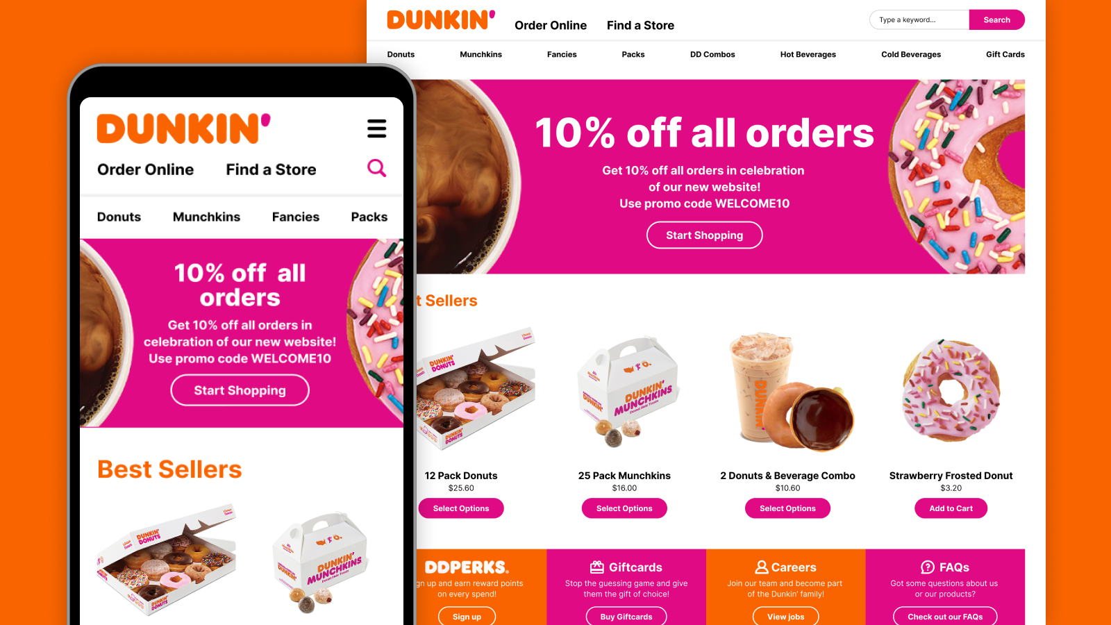
For the header, I've opted for a clean, elegant approach, using lavender from Stuff's brand colour palette. This colour has also been used in the website and apps previously so users already associate it with Stuff, adding to its credibility. Since lavender is also not commonly used by other news sites, this makes it unmistakably Stuff while also not distracting from the content. In addition to this, I've also looked at ways to make the header area more functional.

- Adding links to featured sections - On larger screens, links to featured sections emphasise that Stuff is a news website and showcase the variety of content it provides
- Including 'Watch' and 'Listen' call to actions - On larger screens, these call-to-action buttons highlight our video and audio content, aligning with the growing trend of increased video and audio media consumption. On the mobile app, these elements are instead featured in the bottom navigation bar
- Repositioning the hamburger menu - Moving the hamburger menu to the right, making it easier to reach on mobile
With the added features in the header, I’ve also decided to keep its height short in order to keep the visibility of the content below it high in the viewport with minimal scrolling, optimising content density.
Exploring how to use colours to showcase Stuff's boldness and spiritedness without overshadowing the content
In addition to the lavender, we also wanted to showcase Stuff's colourful and vibrant personality, while also respecting accessibility and making sure our brand didn't overshadow the content. Here are the options we explored:
- Changing the theme on every page refresh / visit - However, there is a risk of a theme loading with a colour scheme that could be inappropriate, particularly during sensitive events such as a terror attack, death, or natural disasters.
- Assigning colours to the different news verticals - Stuff had tried this before and want to move away from this concept because it became too complicated assigning colours as more verticals were added over time.
- Using a colour theme that complimented the vibe of the story - Choosing a colour theme that matches the story’s vibe ensures the colour scheme is always appropriate for the type of content. It’s also less complex than assigning themes to various news verticals, as it relies on a smaller number of set themes.

Highlighting live, lively and content that is always being updated

To highlight live, lively, and breaking content on the website, a rolling "Just in" or "Live now" news ticker has also been incorporated under the header. This dynamic feature enhances the sense of being "always updated." When breaking news occurs, this ticker is replaced by a prominent, dismissible red breaking news bar.
In addition to the ticker, the 'Latest' news is also positioned at the top of the page on larger screens, including a 'Live' feature video when applicable, further emphasising the continuous updates of news content, as it happens.
Additional improvements
Social sharing

As part of an updated experience, we also looked at the social sharing feature in the article page, which had largely remained unchanged since 2015, and no longer meet the needs of audiences today.
To ensure we provide up-to-date sharing options, I looked at the top social referrers on our site and also defined the different types of users:
- Social media user - uses social platforms to share links to friends / family / public (eg. Facebook, Twitter & Reddit)
- Professional - shares links to professional peers (eg. LinkedIn, Slack, MS Teams)
- Instant Message / Chat user - uses instant messaging / chat to share links (eg. WhatsApp, Messenger)
- Non social media user - does not use social platforms (eg. shares by email)
- Others - shares links but social / email options do not cover their specific need
Based on this, here are the options we've provided:
- Facebook, Twitter* and Reddit - our top 3 referrers
- LinkedIn - for people who share as a professional, also our 4th top referrer
- Email - for non social media platform users, or prefer to share by email
- Copy link - to cover options not provided (eg. Intagram and other platforms)
- WhatsApp & Messenger on mobile - for people who share via instant messaging apps
*Stuff later removed its affiliation with Twitter / X as it didn't align with the company's journalism values.

I also decided to use native sharing on devices, allowing more personalised sharing options to the user. However as the web share API is not yet supported on all browsers (eg Chrome on Mac OS), I've also designed a fallback.

For the placement of the share link, based on research, the most familiar placement is at the top and bottom of the article page on web, and either the header or bottom bar on apps. While sticky is also a common behaviour, it does not work for Stuff in that we have full width banner ads running in between paragraphs.
App navigation

For the Stuff app, in order to address the problem of poor navigation between content, I've incorporated a bottom navigation bar to make it easier to browse and jump to the different sections of the site, including the Watch and Listen pages, which are featured on the website header on larger screens. I've also added a shortcut to the Settings page, making it easy to find whenever the user needs to update their app preferences.

For the article page, I've turned the bottom navigation bar into an action bar but also incorporated a back button. This multi-functional bar allows for easier back navigation but also allows users to easily access comments, share the article and adjust the text size settings for easier readability. In addition to this, I've kept the hamburger menu on the header, giving the user the option to jump to another section of the app straight from the article page, rather than having to go back to the landing page they came from.

For the app settings, I've incorporated a 'Done' button at the top for the child pages (eg. Notifications settings), letting the user exit the app settings completely and return to the content they were viewing before entering the Settings page.
Dark mode

One highly requested feature from our users was dark mode support. I developed a dark mode UI with low contrast while still ensuring colour contrasts remain accessible.
To avoid the harshness and eye strain associated with pure black backgrounds with white text, I used various shades of grey to create depth. The farther the layer is to the user, the darker the shade of grey (eg. page background). The closer the layer is to the user, the lighter the shade of grey (eg. popups, dropdown menu). I also opted for light grey text instead of pure white.
In addition to this, I also ensured that the use of bright colours is kept to a minimum, not only to avoid visual harshness and eye strain, but also to cater for the use case of people switching to dark mode to reduce power consumption on their mobile devices.
Final thoughts and outcomes
As the project neared the target date, some design iterations and features were pushed to the development backlog. While it would have been great to see these ideas fully implemented, we still achieved a successful "big bang" release. We were also able to retain our position as the #1 news website in New Zealand, and continue to grow our lead over the nearest competitor. On top of that, Stuff was also named the Voyager Awards Winner for Digital News Provider of the Year in 2024. Despite some missed opportunities, the overall success and recognition serve as a true testament to the team's hard work and dedication.